Style Evolution
This past Wednesday was my first day with both girls in school in close to a months time - it was a glorious (and strangely sad in a way that I didn't expect) 3.5 hours of me time. I worked out, I shopped, I showered in peace, I ate lunch alone and I spent an enormous amount of time strolling blogland.
I settled on Emily Henderson's blog, in particular this post and it really got me to thinking about our home and my style evolution.
the scene of at least 90 minutes of said glorious free time.
She asks: what are the three words you would use to describe how you want your home to feel? Not look, but feel.
After some pondering, I've decided mine are:
Cozy - minimalist I am definitely not!
Fresh - as in not stuffy, youthful, and not too serious.
European - is this a feeling? I think so. I've spent some time overseas and I definitely think there is a feeling that goes hand-in-hand with their culture and I'd like to replicate it as best I can.

Evolution of style is totally normal.
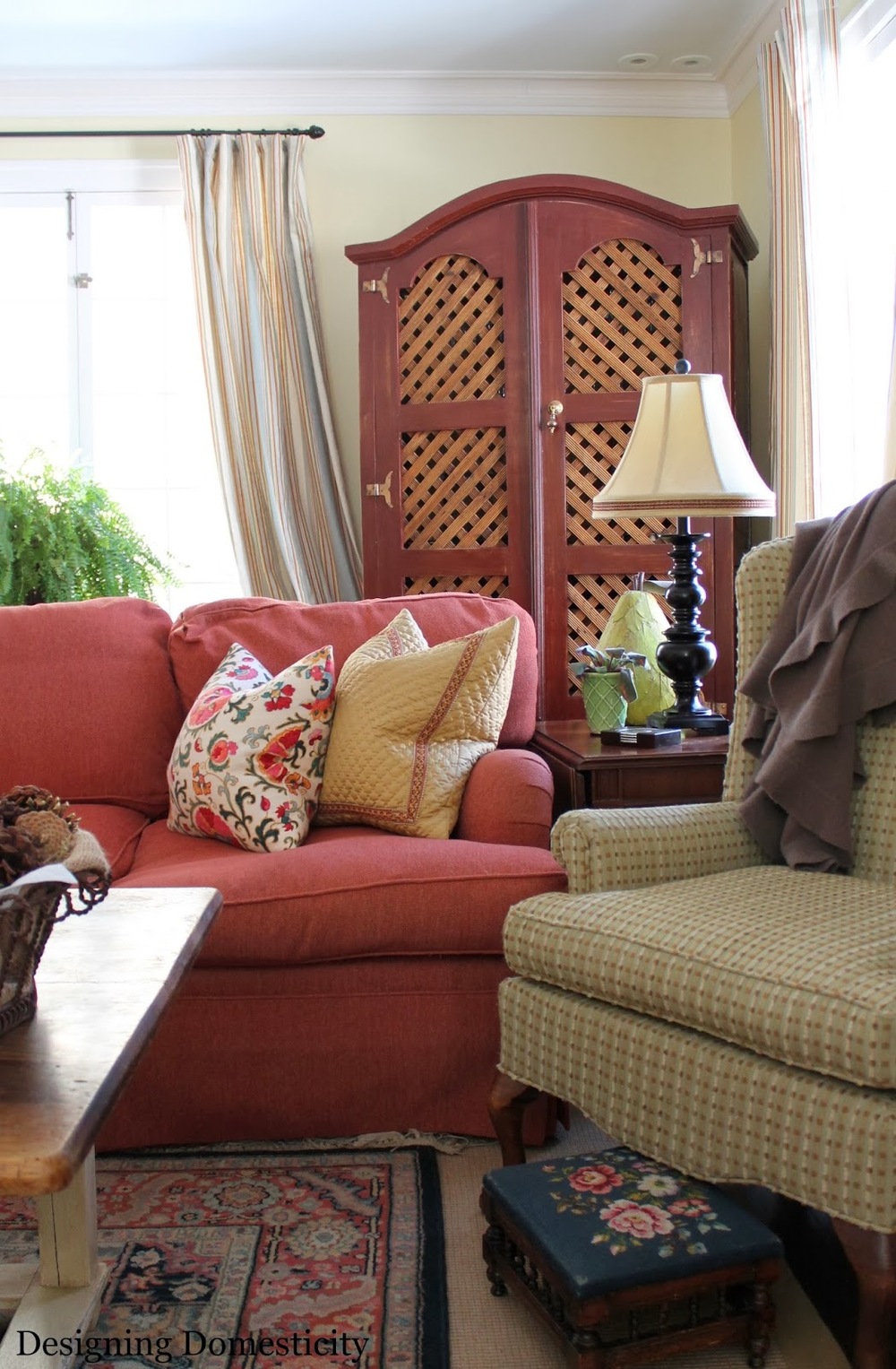
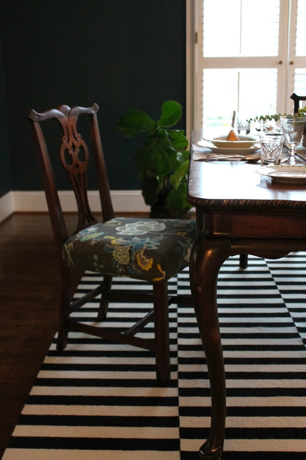
(Image on the left is our Chicago house, image on the right is our Charlotte house.)
It's happened to me in the past and it's happening to me again, right now.
My first condo in Chicago was all dark rich Tuscan-inspired colors, dark wood furniture, oriental rugs. I was influenced by the home I grew up in and what was "in style" at the time. In London, I was definitely leaning toward a French country look, heavily influenced by our travels. Back in Chicago it was all about the farmhouse shabby French look.
Now, I'm evolving again and I'm calling it the Fresh French Traditional or just Fresh Traditional with a French influence or I don't know, something else silly sounding :)
Maybe some images might help explain it a little better…
I love this foyer. It's traditional, without being stuffy. The big dose of black makes sure of that. It feels youthful due to the pop of turquoise. And the massive topiaries flanking the doorway are decidedly European.
homebunch.com
Check out this living room. It certainly has an old world charm to it with the beautiful beamed ceiling, but it doesn't take itself to seriously, despite the ornate crystal chandelier. Just look at the cheerful neon yellow cabinetry.
There is such a juxtaposition here of colors, textures, eras even. Love it.
atlantahomesmag.com
Ignore the fact that this image is clearly from the Christmas season and notice the details of the room and architecture instead. Traditionally French built-ins with chicken wire uppers contrast beautifully with the black and white chevron table spread.
Do you see what I am getting at here? Mixing the old with the new, the subtle with the bold in unexpected ways that keep the traditional from becoming too stuffy.
It's amazing what one fresh element can do to a traditional room/furniture, like our black and white rug paired with the French traditional dining table.
I want to live in a home that says, hey I'm fun! and a young(ish) family that doesn't take themselves too seriously lives here.
Are you getting all that from these images? ;)
So, that's the plan with our subtly French, southern stucco beauty. Settle in, inject a bit of fresh flair into our traditional style, and embrace our style evolution.
linking in with:
until next time,


